Home Depot Inventory Management Dashboard
The well established Home Depot design system is leveraged to create an uniform visual experience for their internal inventory management.

The challenge addressed was incorporation of same functional and visual elements, most appropriate context and call to action for a similar user experience in-house with the determination of what would be the requirements of warehouse/store staff from a warehouse management perspective and how they can efficiently keep track of supplies and items for maximum sale and deployment as well as keep their inventory up-to-date.
Design Goals
Identification of in-house inventory requisites
Setting-up of a uniform user experience as the customer facing web
Incorporation of standard or established visual elements to align the look and feel of the dashboard with existing website
User Research Insights
Understanding of the key users requirements with respect to inventory management
Understanding the present processes and actions carried to manage warehouse demand and supply
Understand current communication methods regarding stock updates
Determine staff users necessary activities to categorize functional deliverables as ‘must have,’ ‘should have,’ ‘could have’ and ‘won’t have’ for the to-be platform.
User Needs/Wants
Clear, concise display of products’ status
Effortless action on supplies inventory: notify, restock, enquire and alerts
Easy communication among store staffs and warehouse employees in and around the area about product related enquiries
Track delivery status of ordered items
Day-to-day status of products and supplies for most recent supervision
Align all staff activity to avoid confusions and miss-communications
Inventory Dashboard Design
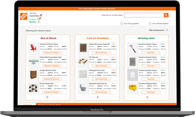
Exclusive account access with unique employee details to avoid random check-ins. To maintain activity alignment between employees of a particular facility, store code (determining facility record/type: store or warehouse) and store ID (referring to a specific number) are provided to sync all users’ activity for a particular combination.
As soon as the user signs in, they can see their store, online status and option to sync all registers to maintain non-ambiguity in inventory management.
For a fast enquiry on a product status, users are provided ‘Search box’ access on the top of the dashboard. They can also filter by departments to navigate to their concerned items effectively without have to undergo explicit scrolls.
Calendar marks day to day activity status. Day wise delivery is displayed as a horizontal scroll. User has the ability to re-visit the previous day’s schedules or view upcoming deliveries for a future date.


To make inter-department enquiry forthright, users are provided visually explicit menu of all available departments and a follow up form to fill in with product/item details with custom message to accommodate versatile nature of asks.


Explicit status of all items are displayed on the Dashboard Home, categorically, ‘Out of Stock,’ ‘Low on Inventory’ and ‘Arriving Soon’ with a precise description of Item Number, Code, Price and Availability Date.
Essential activity for management of these supplies are highlighted for staff action such as ‘Request for Restock,’ ‘Alert Warehouse’ and track upcoming products for an effortless, prompt Call for Action.


For employee communication, I have provided in-store, between store as well as channel to connect to other departments to maximize resolution of any enquiry or information flow.
In-store communication is designed as a candid chat pop-up window which displays all available employees, their status and respective department.

User Acceptance/Validations
Concept Validation Testing was carried out by a field test of the Hi-Fi prototype in select Home Depot Stores inclusive of 3 localized centers by on-duty staff members. Dashboard validation was tested in terms of Behavioral acceptance, Context of Use and On-site Feedback.
The prototype performed well in terms of Participatory Design with an desirability quotient of 0.75 and a NPS (Net Promoter Score) of 6/10.
Take-aways for Design Iterations
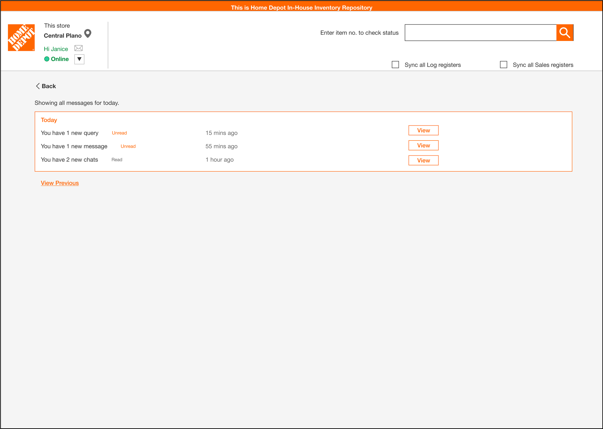
One of the capability desired by the users was to view or keep track of any missed communications.
The provision of a message icon on the top next to their account greetings can actively show any impending or unread messages as well as view the list of all messages upon user click.
Platform: Desktop Application
Tools: Figma, Clipchamp, Miro, Keynote, MS Word
Methods: User research- Contextual Enquiry, Interviews, Focus groups, Desirability studies, Priority Studies
Prototype Build- User Flows, Wireframes, Hi-fidelity prototypes
User Testing- Unmoderated testing, Feedback